This article appears in the March 21, 2011 "Style Issue" of ESPN The Magazine
CLOTHES, MARK TWAIN FAMOUSLY SAID, make the man. But do uniforms make a team? We say yes.
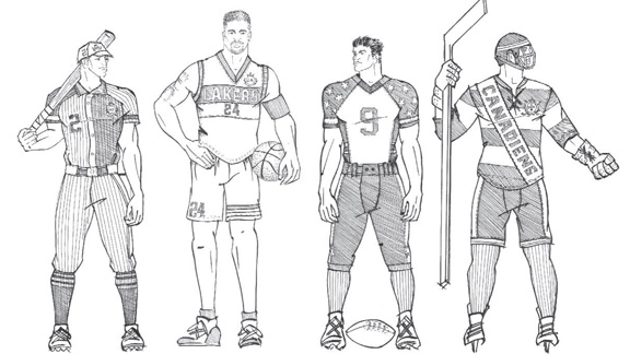
And we're not the only ones. A sharp uni (or even a pin-striped one) modeled by a winning squad or magnetic player over the years can bring fans to great emotional heights -- and move them to scoop up replicas by the closetful. So, in putting together an issue focused on matters of style, we knew we couldn't give these game-changing garments short shrift. In fact, we thought some of the most recognizable unis in sports might very well warrant a style transformation. Enter a designer famous enough to be known on a first-name basis: Tommy.
In the midst of designing for a global fashion empire, Hilfiger, a New York native and longtime sports fan, accepted our challenge to reimagine four iconic and beloved uniforms: those of the Yankees, Lakers, Cowboys and Canadiens.
Foremost in the designer's mind was racking up the style points while promoting practicality. "I've always come from a fundamental mind-set of mixing fashion with function," he says. "It's important to create a design that both represents a team and has a lasting impression." For Hilfiger, that meant incorporating an eye-grabbing, unique logo in his designs for each uniform. "We added the laurels and the crown from the original Tommy Hilfiger Crest label as a simple way to make each sport feel more regal and upscale," he says. "We think the players will definitely feel like they are representing something important."
As the saying goes, if you look good, you feel good. And hey, if you feel good, anything's possible.
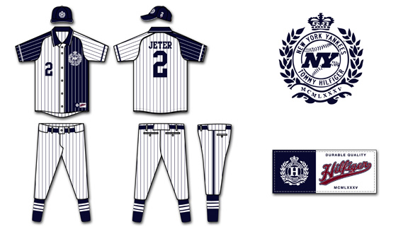
New York Yankees
"My inspiration for this uniform came from my polo shirts. One of the main items in my first collection was a piqué polo shirt that was more relaxed and a bit oversize. Compared to the current Yankees' uniform, the color blocking idea of the shirt speaks to the trend of mixing classical patterns in different colors. I added a collar on the shirt because it always makes everyone look good, and the full button placket taken from our woven oxford shirt allows for a more finished look for the player's suit on game day."
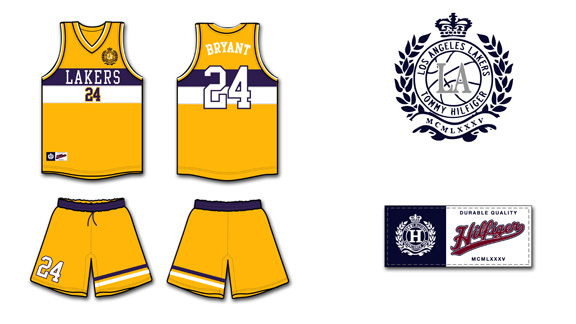
Los Angeles Lakers
"The influence for this design came from reaching deep into the heritage of our brand, and our love of sailing. We love the authentic signal flags that sailors use to communicate with each other on the sea, and the one we liked the best we infused into the uniform. Regarding the length of the shorts, we looked back in history to what Kareem and Bird wore and thought, Could we ever get the players to accept this again? In the end we felt no, but I wanted to go just above the knee for a cleaner, more modern look."
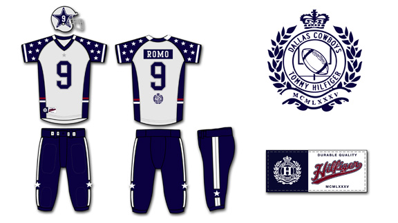
Dallas Cowboys
"If you think about America, the symbol that pulls us together as a country is the flag. Compared to the original Cowboys' uniform design, we love the repetitive feel of the small stars representing a different state that each of the players may come from. Those stars represent the team as a whole, while the helmet represents the player as an individual. We also liked the idea of making each player a star and enlarging it to include his number so everyone would be easily identifiable on camera, even when they're piled up on the field searching for a fumbled ball!"
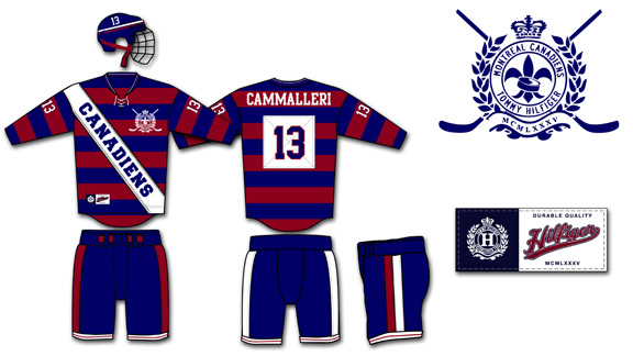
Montreal Canadiens
"I wanted to go in a different direction than the current Canadiens uniforms, which are solid colors. We loved the idea of taking the traditional rugby stripe and incorporating it into a hockey uniform. The tie at the neck area allows a wider opening for putting on and taking off the jersey over all the pads. The zigzag stitch along the front is one of the strongest stitches that can be applied to a garment to withstand pulling and tugging. It gives the uniform a cool twist, but it's functional, too. There has to be a balance."


